
Look what came in the mail!

For me--see?

Bella Figura had a sample sale a few weeks ago--all samples were on sale for $1 and the profits were donated to a good cause, so I bought a couple for some DIY invitation inspiration.
One thing this whole process has taught me is that I am a sucker for paper.

Is it a little weird that the word that comes to mind is "yum?" I know, it is.


The first sample is the "Hendrix 2." I love the bold typeface used for the names, and the sweet details around the text.
And the invitation that stopped me in my tracks:

"New Caligraphy." Sigh. If I could just pick an invitation off their site this would be it, without a doubt.
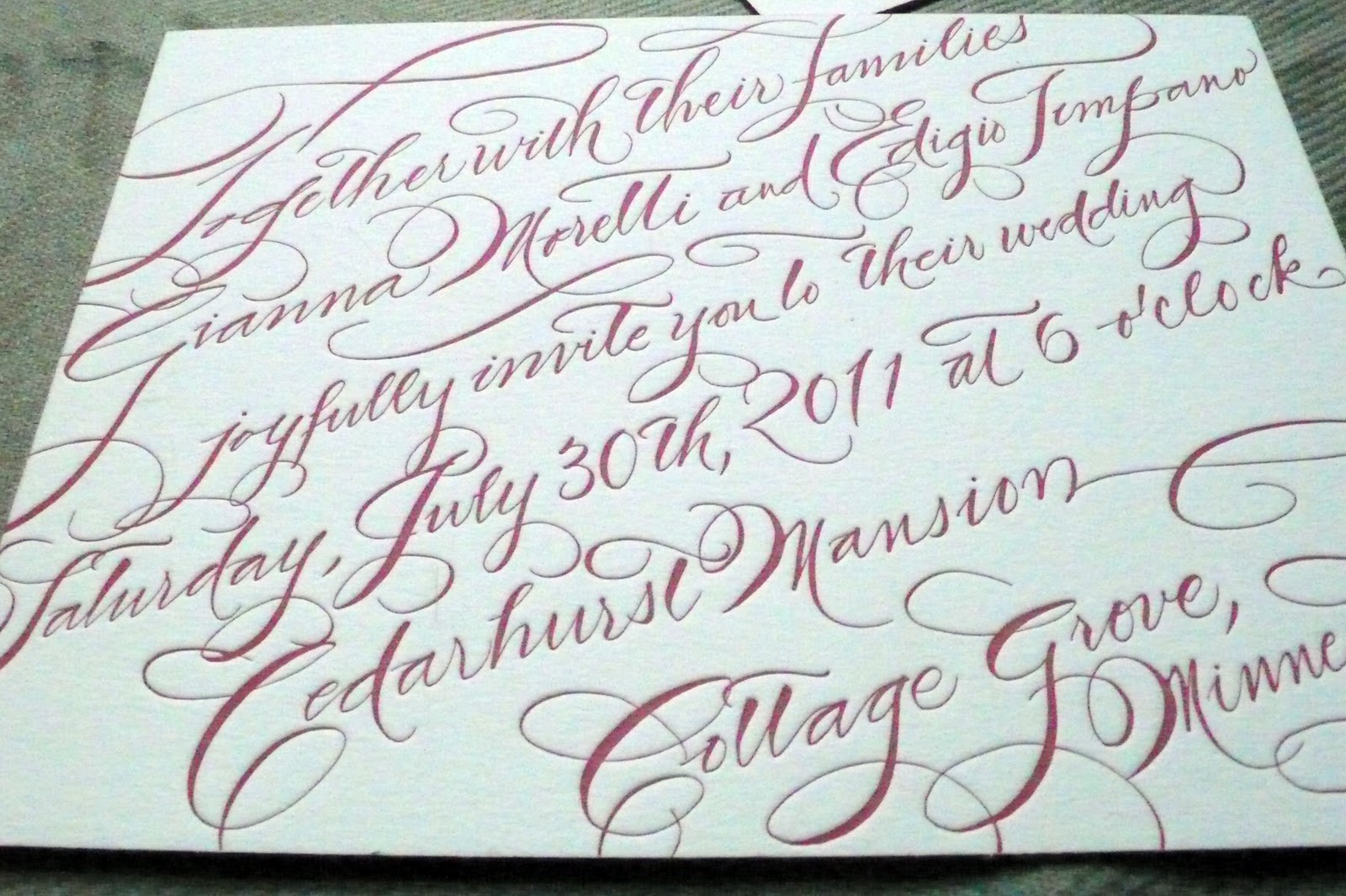
I'm fascinated by the hand calligraphy, here--can't take my eyes off it.

It's still a little tough to see it here, but the edges are painted. Painted!
And can you see the lush Letterpress Cotton 2-ply paper?

It's absolute perfection. The only problem is, we're not going to be able to splurge for letterpress or calligraphy. And if you ask my mom, the invitation is a little hard to read...
So there are a couple things I'm going to keep in mind, as I sit down to design our invites with Lil $is:
- Landscape format (when the paper is "sideways," or the horizontal edges are longer than the vertical edges).
- Edges: painted and rounded.
- Not too big. The only downside to my favorite sample is the size, it's 8.38" x 6.25". It's a little too bulky for me, and I'd like to avoid extra postage, if possible.
- Find a font that has the feel of calligraphy but not the price (and maybe a little easier to read).
- Lastly, try to add a modern element to the invitation. I want to avoid going completely traditional, so I may try to include a bold detail somewhere in the invitation suite.
What do you think? Where did you find your DIY inspiration?


No comments:
Post a Comment