Pages

Showing posts with label Paper. Show all posts

Wednesday, May 4, 2011

Thing I Never Thought About Before I Started Planning Our Wedding #534

Stamps.  


#534 on the list of "Things I Never thought About Before I Started Planning our Wedding."


It's safe to say that these stamps are my all time favorite (because I'm keeping track now) :


I liked them so much that I eagerly affixed them to our save the dates without thinking about the future, and by future I mean our invitations.  

The thing is, to stay in budget we decided not to go for custom stamps even though they could have really looked amazing.  BUT, we did agree that we would think about it if the postage for our invitations came to be something that would require way too many stamps. 


Would I be stuck with the standard Forever Stamp?


I crossed my fingers as I waited for the verdict from the postman.  And wouldn't you know it?  Our postage came out to a perfect 64 cents. Just one stamp.  Just like that, I'd lost the custom stamp battle. 


Defeated, I reviewed our choices on USPS.com and was alarmed at first by the lack of variety:


EEP!  NO! Don't get me wrong, who doesn't love dolphins (I love dolphins, I do)?!   I mean, I wasn't feeling the blue dolphin stamp since it kinda clashed with the envelope.


The ubiquitous and convenient wedding cake stamp!  I actually like it, but here's where I'm going to sound like a neurotic "overthinker"-- it's too off white and it's just not right for our invitations.  Yeap the cake is too off white for our pearl white invitations (adding that to my list of "Things I'd Never Thought I'd Actually Say" right now).  Those were the words I used to explain my objection to the Bear.  And can I tell you that his response was pretty much "wha?!"  Yeap.  [Slightly] Neurotic and "overthinking" bride in the house!

And then, dear friends, (to my surprise) I found a winner.  


The Monarch stamp!  Not that Monarch butterflies have any connection to our wedding (unless anyone knows a tidbit of scientific information that links their migration to NY state weddings in July)but, I kinda like it!

It's a bold pop of color and it's pretty--but not so pretty that a guy (namely my groom-to-be) would hate it.  It's white and not cream and it doesn't scream "WEDDING!"  Simple, bold, and not custom!

Thank you USPS!  Now, please keep the cute stamps coming!  


Whoa.  Sounds like they might be listening.  So if you are, USPS, please PLEASE update the wedding stamps.  And keep up the good work with the others!


What unexpected wedding detail have you obsessed over?  Did you splurge for custom stamps?  Or did you go traditional with the wedding cake/rings stamp?


Thursday, April 28, 2011

A Love Letter to My Home Printer


Dear Printer, 

You were groomed purchased for just one purpose in this world:  to help me print the paper goods for my wedding.  You were left in the box for a few months and then carefully set up.  I tested you on occasion, to make sure you were still in good working order, and you always were.  And almost a year later, it is now the time for you to live up to your destiny.  In short, I treated you well so

WHY ARE YOU BEING SO HOSTILE?

You insist on eating my envelopes and jamming them deep into your mechanical innards, where I have to use pliers to remove them.  You skew my labels and refuse to print my addresses in the center but for one in every three envelopes (what is that, tre-cimation?).  And you only print the rare "good envelope" after you've been given an hour or more of rest?  Labor laws do not apply to home printers, dude.  I hate to break it to you. 

So in short, I'm onto you.  You have made my blood pressure rise and delayed every single paper project I have tried to work on.  But my invitations are the last straw.  

Have you ever seen "Office Space?"

Of course you didn't because you were only assembled in 2010 and you don't have eyes. 

BUT watch out, Printer--your number is about to come up.

xo,

Mich

Wednesday, January 5, 2011

What the Font?!

I've finally decided on our wedding fonts!  Wanna see?


Sidenote:  Did you know that they aren't called fonts?  They're called typefaces.  I angered a professor once by calling them fonts.  But I'm choosing to use the word "font" here to describe the typeface, for any graphic design junkies--don't want to ruffle any feathers.  And I had to use that title!  I couldn't resist! 


Back to what I was saying, it took a lot of experimenting but I think I'm finally happy with what I'm working with!


First, let me introduce you to our headers!


Memoriam Pro:


I fell in love with this font a while back and bought it on a whim.  It was a splurge, so I'm going to have to use it somewhere!  Looking back I should have resisted this purchase and saved the cash for another project, but I'm happy to have it!  And I know it will look gorgeous wherever it turns up!

Next up is Aphrodite Slim:


Since we don't have room in the budget for calligraphy, I had to find something that had the same qualities I loved in calligraphy but without the hefty price tag.  Isn't it pretty?  Aphrodite will be right at home on our invites, maybe even center stage! *hint*hint*

And then there are the fonts that we're going to use in the body of our paper products.  They are decidedly less swirly and more crisp than the fonts above.  


American Typewriter has been a favorite of mine for a while now.  It reminds me of books and old correspondence, which is the same feeling I want in some of our paper products.  I used it in our save the dates too, so it's nice to have a little continuity.  Of course, I'm going to be the only person to notice this but it's the little things that make me smile!


And finally my new favorite, Estilo!  I've started to become obsessed with all things Art Deco, especially in design.  This was another impulse buy, but thankfully it worked out!  It's a perfect way to introduce some Art Deco elements to the decor without losing the modern feel we're going for.  I'm thinking this will work for our invites, menu cards, and banners (that I haven't started on yet--ack!).  

And there you have it!  I'm relieved to finally have made some progress on this, and now there is no room for excuses!  Time to roll my sleeves up and get busy!

What do you think?  DIY brides, did you have to find any special fonts or design elements before you started working on your wedding projects?
   

Tuesday, December 21, 2010

{Invitation Inspiration} Just My 'Type'

My attitude towards DIY invitations was little wishy-washy.  One day I believed I could create every little detail for our wedding, including a beautiful invitation suite.  And the next day I'd realize that my DIY list was getting out of control, so I'd frantically scour the internet for ready-made designs that fit our budget.  

Then one day, I realized that time was running out and I had to decide between purchasing or designing our invitation suite--and my urge to DIY prevailed!  And so, in honor of my creative ambitions, I've decided to share with you some of our invitation inspiration. 

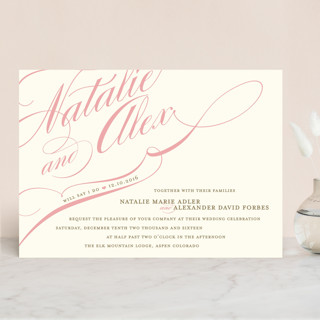
First up, the Winter Flourish Wedding Invitations from Minted:  

Image via Minted / Design By Annie Clark

I bookmarked this design nearly two years ago and I still love it--the size and placement of the names just tug at my heartstrings.  The swirls and flourishes are a "must have" in our design.

I don't plan on using a ton of color or a floral motif.  Just simple, gorgeous type.  

Image via Etsy / Invitation by OhSoSuite 

The next design is by Oh So Suite and features the name of the couple in another gorgeous oversize script.  My favorite detail here is the layout, it's in landscape or as my friend described it, "the paper is sideways."  

Design and Image via HelloTenfold

This adorable invitation by Hello Tenfold featured a beautiful swirly typeface, and a gorgeous vintage banner.  It's somewhat simple, but still really beautiful and modern.  

As far as the rest of the suite is concerned there was one more element I knew I was going to include:

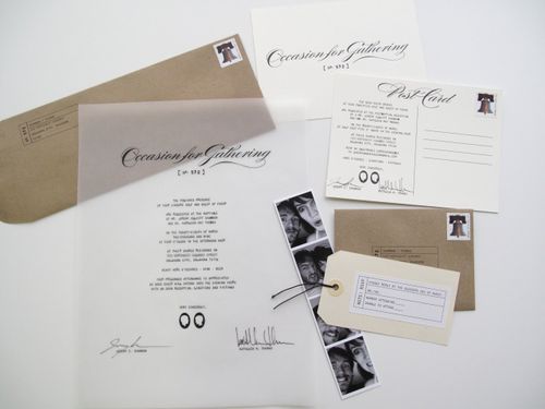
Image via OhSoBeautifulPaper / Design by J+K

Vellum.   This suite, featured on Oh So Beautiful Paper, actually uses vellum in the main invitation.  I thought I would go the route of vellum envelopes or better yet a vellum enclosure, maybe with a quote on it.  

Something like this: 

Image via TheIndigoBunting / Design by Erin Jang

I liked the idea of using a quote to introduce our invitations, and this quote was almost perfect!
  
And there you have it, our invitation inspiration.    Lots and lots of big swirly type, a touch of vellum, possibly a quote, and for good measure, we're flipping the layout on it's side. 


How about you?  Are you going to DIY your wedding invitations?  Where did you find your inspiration?

Friday, October 22, 2010

Happy Friday! Making Progress...

Making progress on our save the dates! Here's a little sneak peak--


It's taken every bit of self control to keep me from rushing through these babies and sending them off into the world.  The plan is to send them out in two weeks,and I'm sticking to it!

But that doesn't mean I can't share one more teeny-tiny peek at my progress:


So excited!  The plan this weekend is to try to recuperate and kick this cold that will not go away.  Cancelling plans to enjoy a little CMJ action, but I suppose I wouldn't enjoy much of anything when the world sounds like my head is under water.  

So how's your weekend shaping up?

Thursday, October 21, 2010

Inspiration: Paper

I've been feeling under the weather lately, so I bribed myself out of bed with a chai latte (I could drink one every day and be a very happy girl).  And I got to the cash register and saw this:


Finding inspiration in the most unexpected places, Starbucks, to be exact.  I had to resist the urge to buy this album so I could look at the calligraphy later.  

Wednesday, October 6, 2010

American Heroes

I ran into the Hallmark Store a couple of weeks ago to grab a card for my friend.  As I was walking down the aisle, a small section cards called "American Heroes" caught my eye.  I laughed to myself and walked by, the Bear would not want a card from anything called "American Heroes." But then I hesitated and went back to check them out.  


I immediately picked a card out that I knew he would love.  I couldn't find a picture of it, but it looked similar to the one pictured at the top.  And yes, I walked out of the store with it. Hook, line, and sinker. 

According to Hallmark's corporate site, the American Heroes collection was created in 1917 for those serving in WWI.  They've created cards for each major war since then. And they've kept each card to $1.99.  


With sentiments ranging from lighthearted to religious, it looks like Hallmark truly does have a card for everyone. I was able to find a card that pretty much said, "I miss your face," and I do.  And I know that he appreciated the funny sentiment. 

The one thing that strikes me, however, is that this product doesn't have a tie to anyone in the military.  I could be wrong here, but it would appear that these cards are solely for profit. If I'm wrong, please let me know. But personally, I would feel much better about buying a card like this if a portion of the proceeds went back to a veterans organization.    Because ultimately, who is buying the majority of these cards?  My guess, is that they are military families.  Something about that bothers me. Of course, it wasn't enough to keep me from buying a card and talking about it here.  But I doubt I'll buy another.  I'm pretty good at making my own.  I appreciate the fact that they exist and I appreciate the fact that the cost remains low, when compared to other cards.  Personally, I'd be happier to pay $2.99 per card, knowing that something was given back to veterans in return.  Because outside of written sentiment, isn't action an even better way to honor those that have served our country?